Time frame: 2 weeks
Role: UX Designer (research, interaction design, visual design)
Tools used: Illustrator, Photoshop, XD
Role: UX Designer (research, interaction design, visual design)
Tools used: Illustrator, Photoshop, XD
Slowly But Surely is an app that helps users log their breakup recovery journey.
Challenge
Breakups suck, and they can have a profound impact on our lives. After you've binge-watched five seasons of your favorite TV show, cried to ballads, had a few buckets of ice cream, what's next?
Goal
Design and develop and app that can help people process and learn from painful breakups. I wanted to create an app for people who are ready to begin processing their relationships in order to become wiser and stronger.
Research Insights
Competitive Analysis
I explored four different apps that popped up when I typed in "breakup" in the App Store. I also tried out a few other apps that tried to help users resist the temptation of contacting their ex (aka No-Contact apps) and a breakup box app that gave users virtual "boxes" to store and lock away memories of their ex like pictures and text messages.
I found that self-care apps tend to either be heavily community/discussion-based or individual-based with an AI chatbot. Based on reviews, these apps can be frustrating to use at times because they're very minimal and don't provide the user with a good journal or view of their log/history.
Netnography
I went on the BreakUp subreddit to find what people there did to cope with their breakups and what they struggled with the most. I found that there were people who were lost on how to communicate with their ex, let go of resentment, and how to go no-contact.
Persona
I created two personas that differ in terms of where they're at post-breakup. Melanie has come straight out of rocky relationship and is looking for comfort and guidance while Aiden has had time to process and move on from his breakup and is looking for concrete advice to grow and learn.
Ideation
Feature Matrix + Sketching
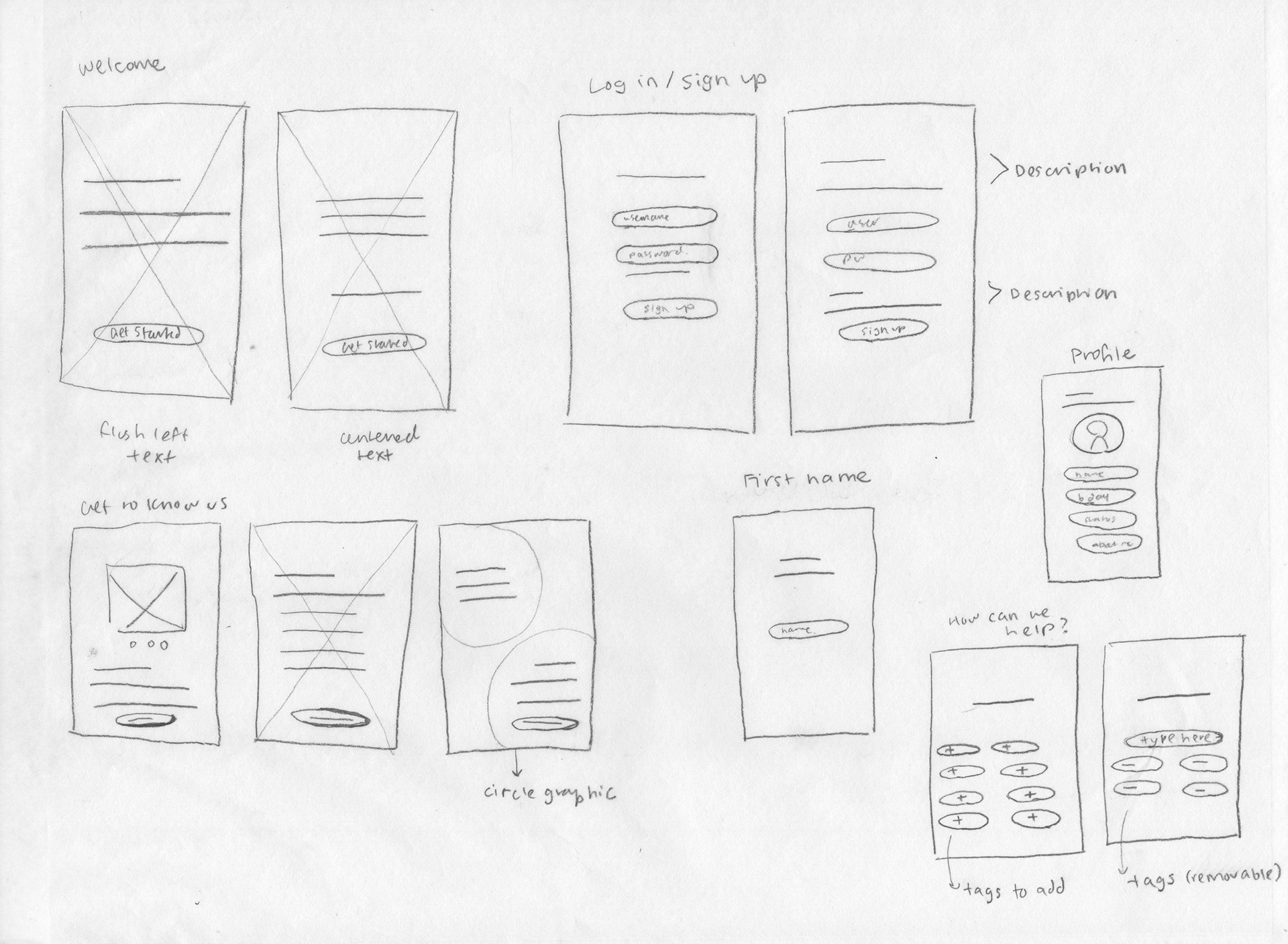
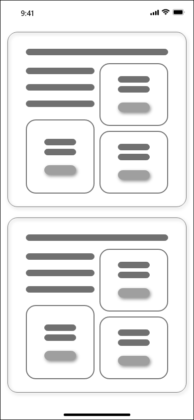
Based on my research and personas, I created a list of features I wanted the mobile app to have. I tried to create a balance between Melanie's and Aiden's needs and rated each feature on a scale of 0-5, 0=not important and 5=very important. I wanted to include a robust journaling feature and mood tracker for people who were in the midst of a breakup and a discovery section to help those further along in their breakup recovery. I thought it was important to include a more comprehensive journal or log because those were common complaints users had on the apps I researched.
Onboarding
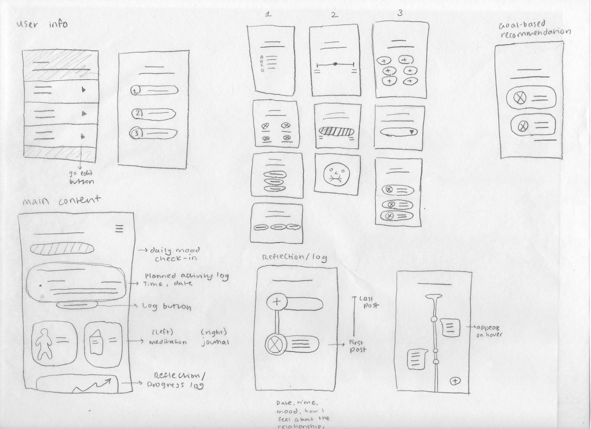
Main Content
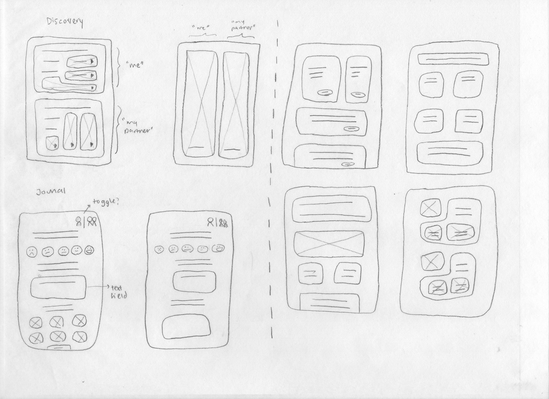
Self-discovery & Journal
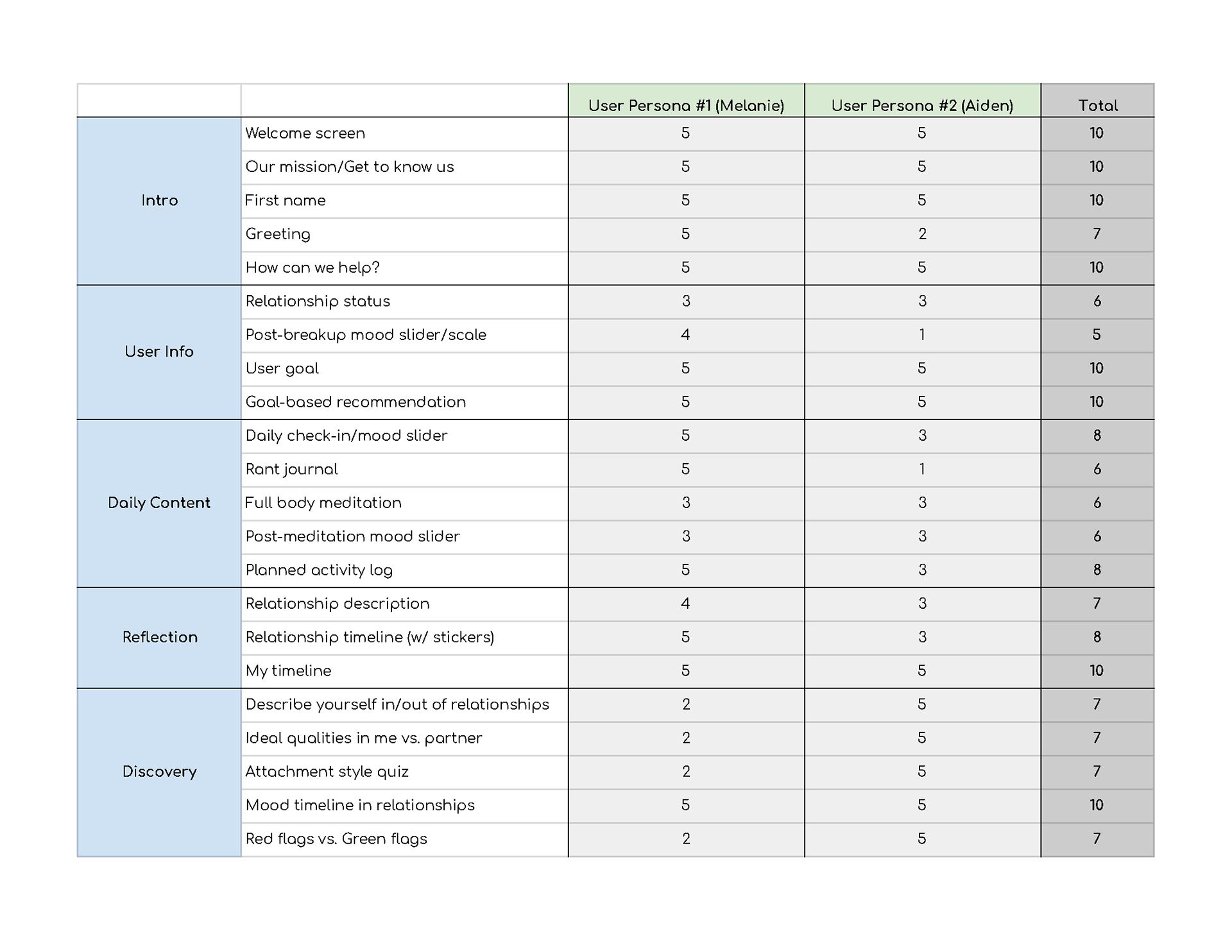
Feature Matrix
Solution
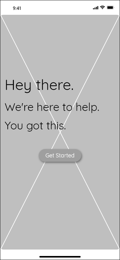
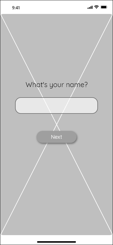
I wanted the app to have a smooth onboarding like mend, one of the apps I researched. I liked that mend didn't pressure the user to fill out a form but instead asked the user for personal information through step-by-step dialogue. I also thought that letting the user explore the app without asking them to register right off the bat was important to keep them engaged.
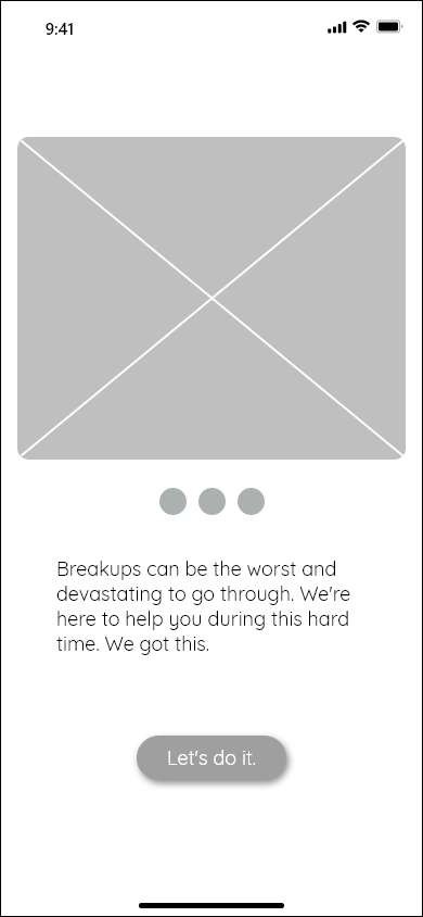
I made sure to include a screen that would display some information on the app to establish a sense of trust and reliability before asking the user to do anything.
Lo-Fi Wireframes
Welcome
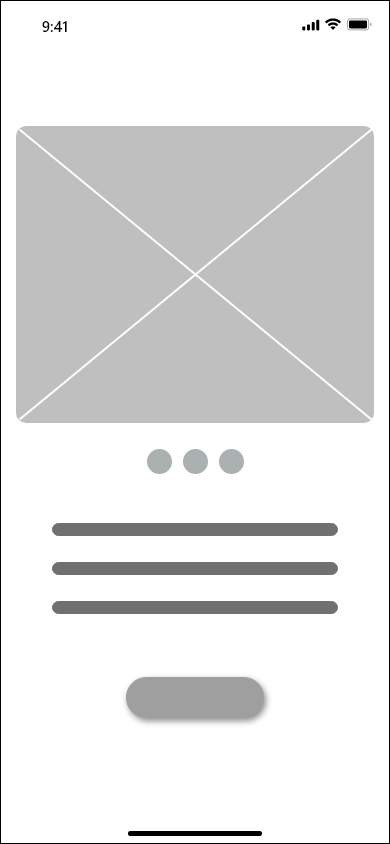
Get to know us
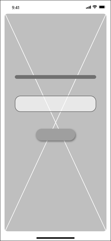
Who are you?
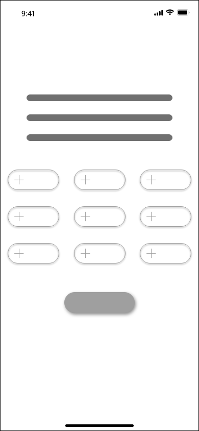
User struggles
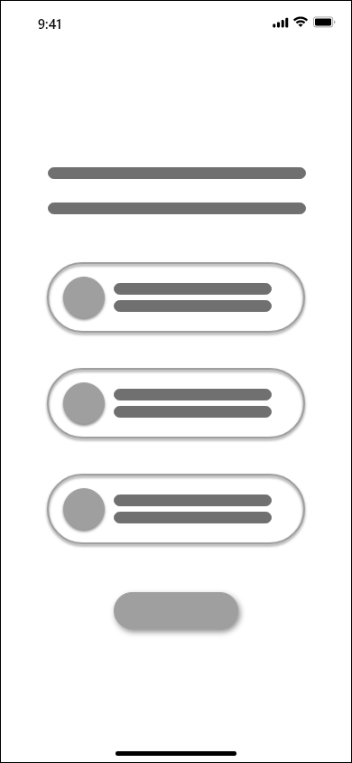
User info
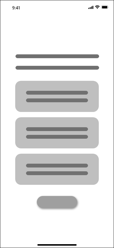
Recommendations
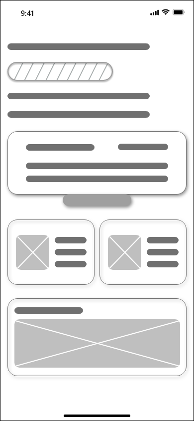
Main content
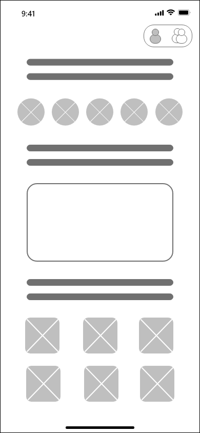
Journal - Me
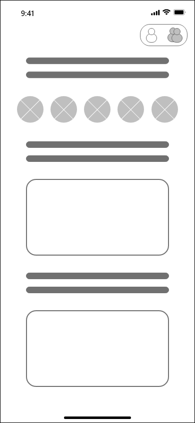
Journal - My relationship

Reflection/Log
Discovery
Hi-Fi Wireframes
Welcome
Get to know us
Who are you?
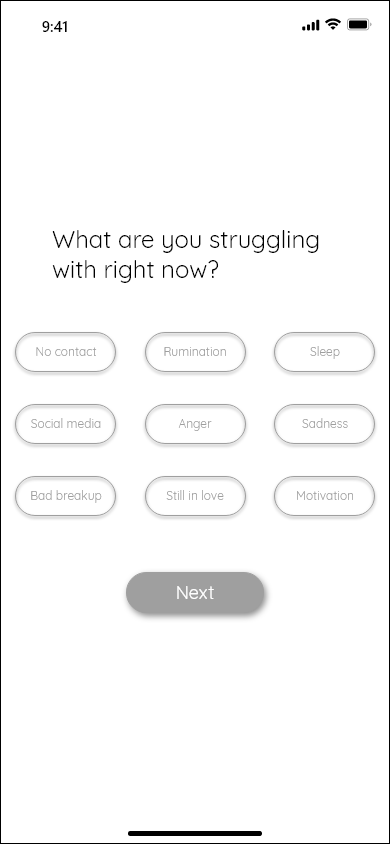
User struggles
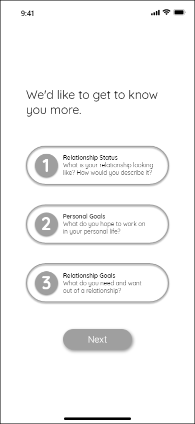
User info

Recommendations
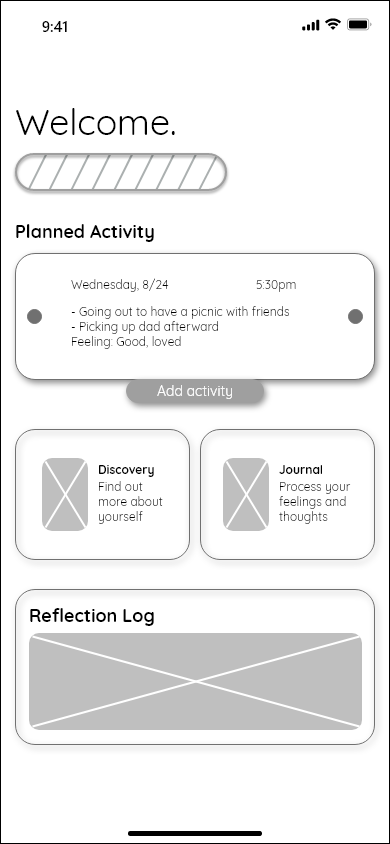
Main content
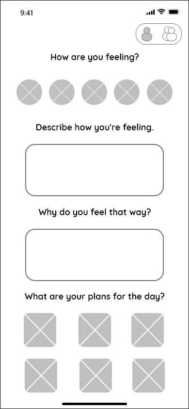
Journal - Me
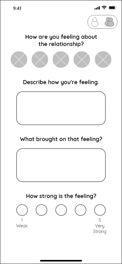
Journal - My relationship
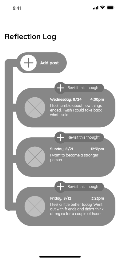
Reflection/Log
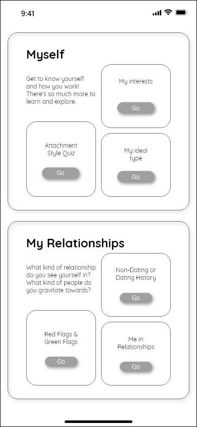
Discovery
Prototype
I added a light color palette, icons, and emotes to give the app a friendly look. I wanted to go for a gender neutral look to keep it inclusive and welcoming to all people. I also added rounded corners and curves to keep it on-trend with other apps on the market.

Welcome

Get to know us - 1
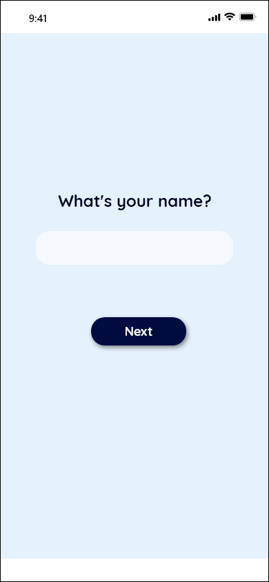
Who are you?
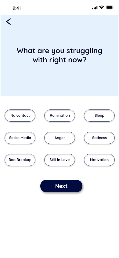
User struggles
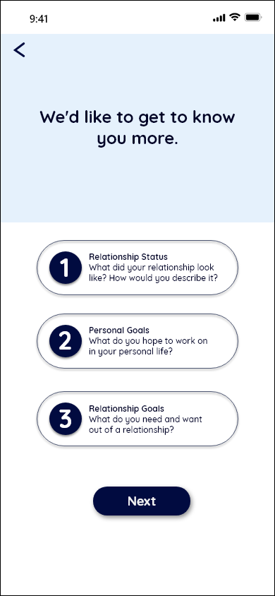
User info

Recommendation
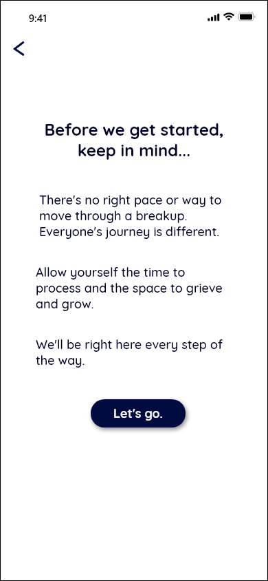
Get to know us - 2
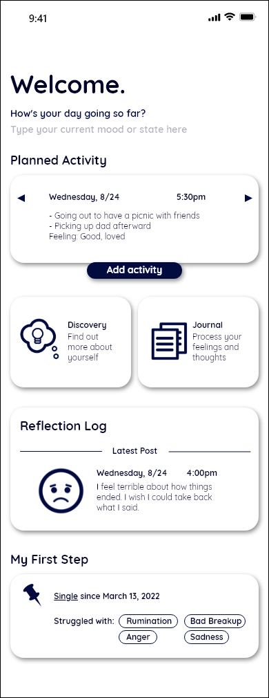
Main content
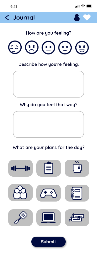
Journal - Me
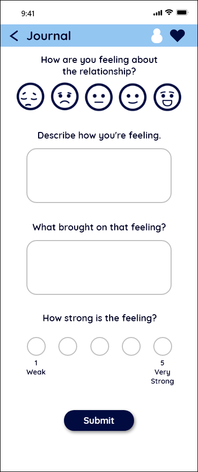
Journal - My relationships
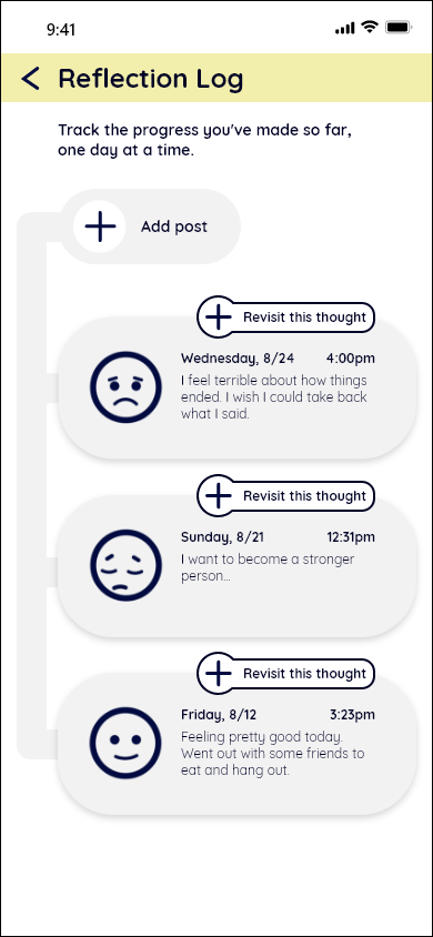
Reflection/Log
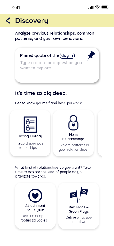
Discovery
My Reflections
It was the first time I took on a mobile app project from start to finish. It was a difficult project, and I don't think I would've gotten anywhere without the personas I created. I realized that when designing a product, it's crucial to know your target audience. Although there was a lot of overlap in what people seemed to need after a breakup, people can be in different stages of their breakup journey and may need different advice at different times. I found it hard to make the app focused yet comprehensive. If I had more time, I'd definitely test it out and try to refine it more because it feels text-heavy and could use more hierarchy.


